

Case Study
CareNautica
Cut a health app from five features to three, tested it with patients and caregivers, and designed the engagement system that went into an NIH SBIR application.
What is CareNautica?
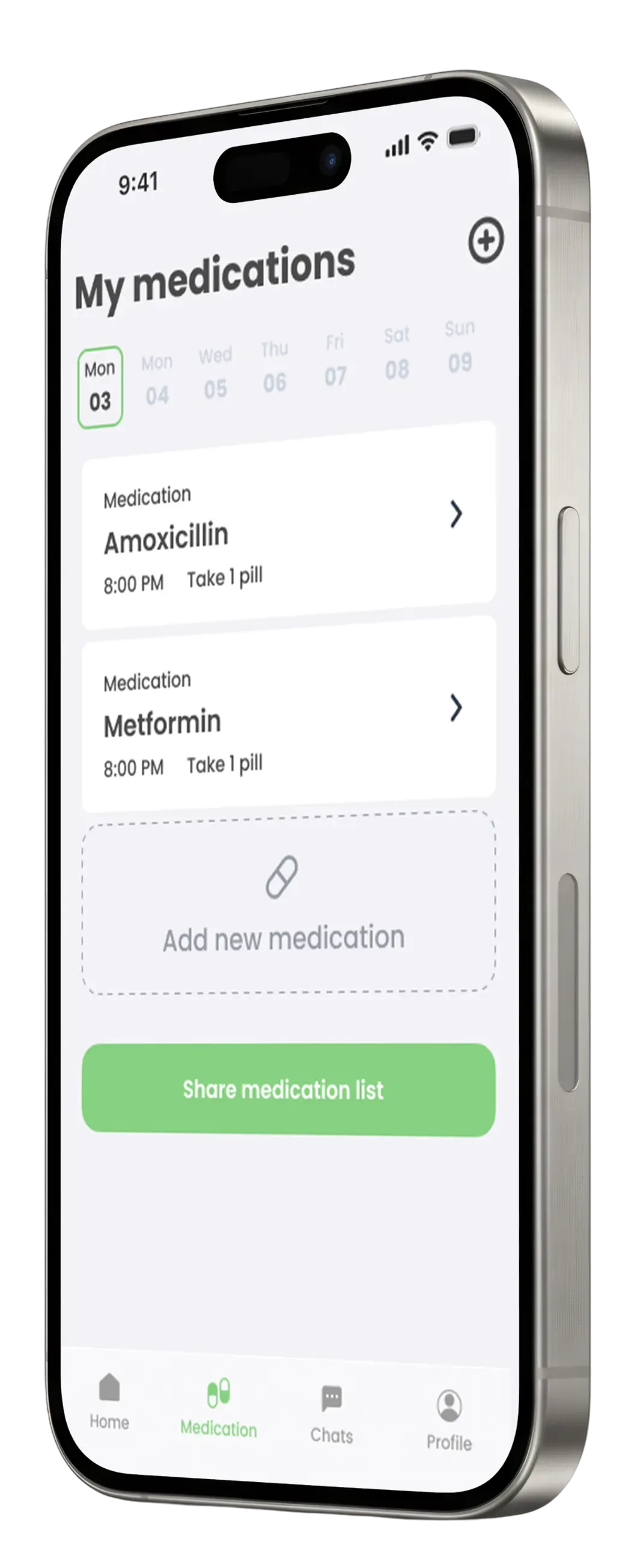
CareNautica is an app for people living with a chronic condition and the people who look after them. The patient does a short check-in every day and logs their medications. Then they decide who gets to see it: a small circle of up to six family members, friends or caregivers. Caregivers stay in the loop without having to call and ask how things are going.
Three features make it work:
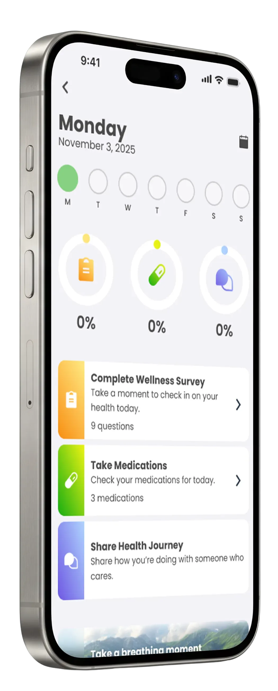
Wellness Survey
The daily check-in.
Medication Tracker
A list of what the patient takes, shared with the people they choose.
Chats (care circles)
The small group that follows the patient's progress, as long as the patient allows it.
At a glance
- My role: Lead product designer. An external HCI consultant set the route, and I did the rest: personas, surveys, prototypes, usability tests and the gamification system.
- Scope: Two phases, two years apart. The first turned a rough concept into a tested product. The second designed how to get people to keep using it.
- Two decisions that mattered: cutting five features down to three, and choosing intrinsic motivation over financial rewards.
- Outcome: Phase 1 helped the client secure funding. The Phase 2 work went into an NIH SBIR application, which is still pending.
Context
The client came to our studio with a big idea: a rough concept and a Figma prototype whose screens didn’t really connect to each other. There was no research behind it and no logic tying the features together.
That’s a hard place to build from, and an even harder one to ask for funding from. A grant reviewer will ask why each feature is there, and “because we thought of it” isn’t an answer. So the job had two parts: give the product a direction, and make every decision something we could defend, to users and to the people evaluating it.
There was a second problem waiting behind the first one. A health app can be perfectly designed and still fail if nobody opens it tomorrow. We’d get to that in Phase 2.
Refocusing
Before touching any screen, we ran a KPT analysis (Keep, Problem, Try) on the existing prototype. It found too many features, not bad ones. Five features across two types of users was too much to validate in one phase. If we tested everything at once, we’d end up with thin evidence for all of it and solid evidence for none.
The scope itself was the risk, for the product and for the grant that depended on it.
So we recommended cutting. The care information section and the reward shop were out, and Communities got smaller. The original idea let users join large, location-based communities. We proposed starting with a small circle of trusted people, seeing whether anyone wanted it, and only then deciding if it should grow into something bigger.
The client didn’t love this at first. These were parts of their original vision. What changed their mind was seeing it: I built wireframes of a smaller, connected version, so they could judge it for themselves. The KPT gave them the reasoning, and the wireframes gave them the picture. They came around.
Before: 5 features
Care informationReward shop- Medication tracker
- Wellness survey
- Communities (large, location-based)
After: 3 features
- Medication tracker
- Wellness survey
- Chats (care circles of up to 6)
Research and validation
I started with two personas, one for patients and one for caregivers. I used them to get clear about what we didn’t know. Then I turned those questions into two surveys for patients and caregivers in the US. The answers shifted what people expected from the product, and quite a few respondents asked to try the prototype. That was our first sign that people actually wanted this.
Next I built a semi-high-fidelity prototype of the three features. I kept it unpolished on purpose. It needed to be good enough for honest feedback, and not so finished that it would need redoing after the feedback. We tested it in two ways: a Maze usability test (20 participants, just over half in the 60–79 target age group) and two focus groups (6 participants).
- What Maze showed
- People could get around. The main flows were easy to follow, with one exception: setting permissions in Chats was confusing.
- What the focus groups added
- Caregivers liked the idea of a care circle, but only if they had fine control over who could see what. In simple words: without that control, they wouldn't use the app at all.
- What we changed
- Permissions became a shared job. Both the patient and the caregiver they designate can manage them, so control doesn't depend on one person getting the setup right. I should say that we didn't validate this change. It wasn't part of either phase, which were about validating the product and its features, and then the gamification system.
Since the main audience was older adults, I also removed everything that wasn’t strictly necessary from each screen. Showing less means less to process. It helped everyone, including the younger users.
Gamification
Phase 1 showed that CareNautica was usable. Phase 2 was about a harder question: why would someone open it again tomorrow? When the goal is taking medication on time, that return visit is everything.
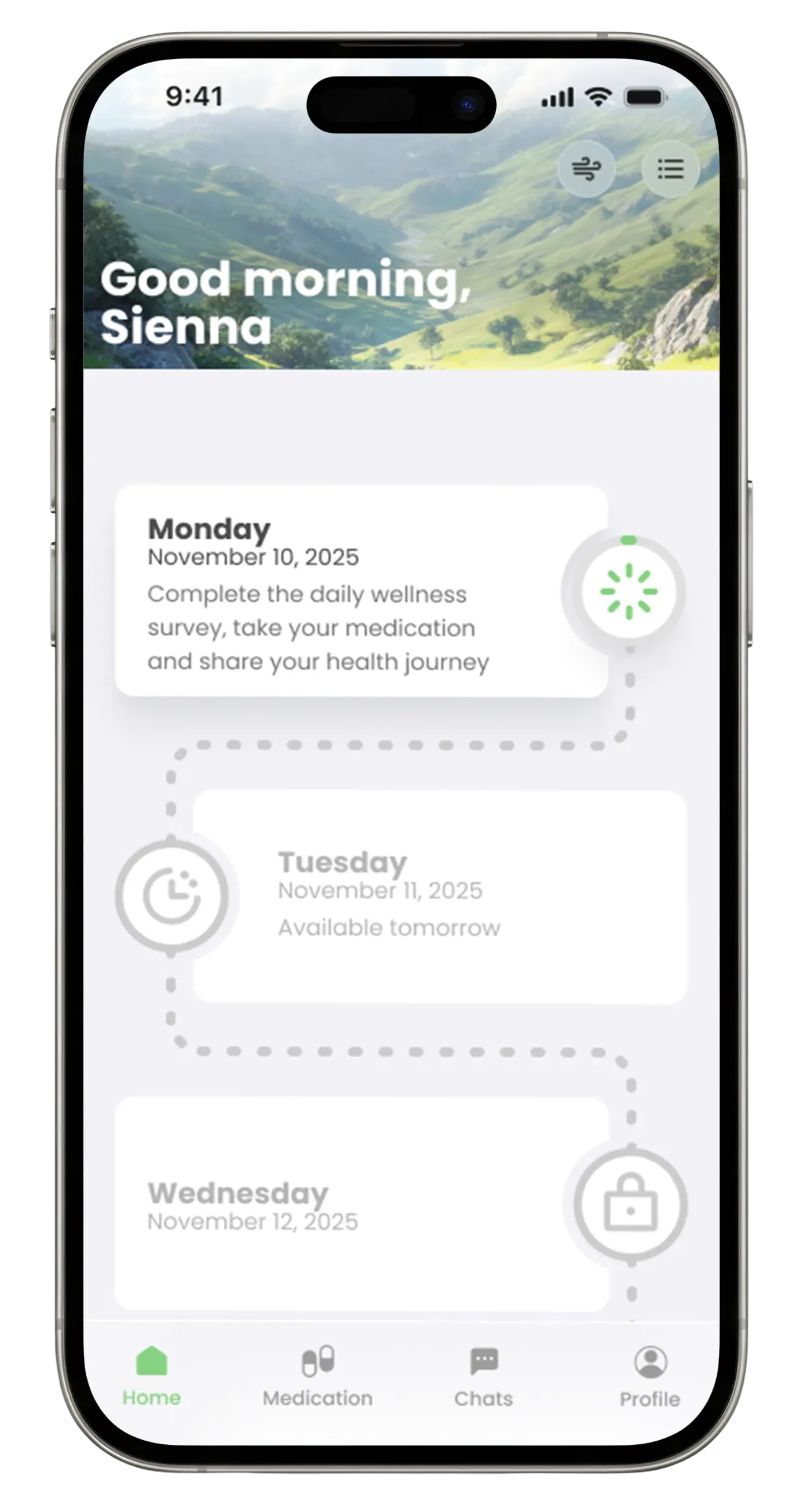
For the NIH SBIR application, I designed an engagement system. Each piece targets one specific driver of habit formation, drawing on four behavioral frameworks (SDT, FBM, SCT and IMB). Here’s how they connect:
| Feature | What it does | Behavioral driver |
|---|---|---|
| Journey Path | Daily and weekly milestones that turn routine care into visible progress | Habit formation and clear triggers |
| Goal Ring Progress | Shows how close the user is to each day’s goal | Competence and self-efficacy |
| Mini Wellness Moments | Short, easy actions that fit into the day | Ability and skill-building |
| Encouragement Cards | Support from the people in the care circle | Relatedness and social support |
What we chose not to build
Gift cards, financial incentives and brand rewards are the easy way to get people back into an app. They work in the short term. But in a medication app they come with a real risk: someone could log doses they didn’t take to earn the reward.
So we went the other way, with intrinsic motivation: visible progress, support from the care circle, and the option to donate to charity. It builds habits that last, it’s defensible clinically, and it’s what a federal grant reviewer wants to see.
- Goal Ring mission success (57 participants)
- 93%
- ease of use
- 4.2/5
- visual appeal
- 4.5/5
This was a product decision, and also the argument that positioned CareNautica as a serious clinical tool, rather than another health app chasing engagement.
Outcomes
Phase 1 gave the client the research and the tested prototype they needed to move forward. Phase 2 delivered the behavioral system and the usability results that went into the NIH SBIR application, which is still waiting on a decision.
The client secured funding with the validated product and commissioned Phase 2. The gamification system and usability results were submitted as part of the application.
What I find most interesting is the gap between the two phases. After Phase 1 ended in February 2024, the client spent over a year looking for funding to keep the project alive, and found it. When the NIH opportunity came up in October 2025, the Phase 1 research still held up well enough to build a federal application on.
What I took away
- Cutting scope was the most useful thing we did. Less to test meant better evidence for what stayed.
- Privacy decides whether people use the app. Caregivers told us so directly, and it shaped how permissions work.
- A usable app and a habit-forming app are two different problems. We solved the first in Phase 1 and the second in Phase 2.
- Not everything gets validated. The permissions fix is a good example. Knowing what you tested, and what you didn’t, is part of being honest about the work.

