

Case Study
Atama
Designed the design system and reusable features of a white-label base. MVPs went from 2–3 months to under one, and every new project at the company now starts from it.
What is Atama?
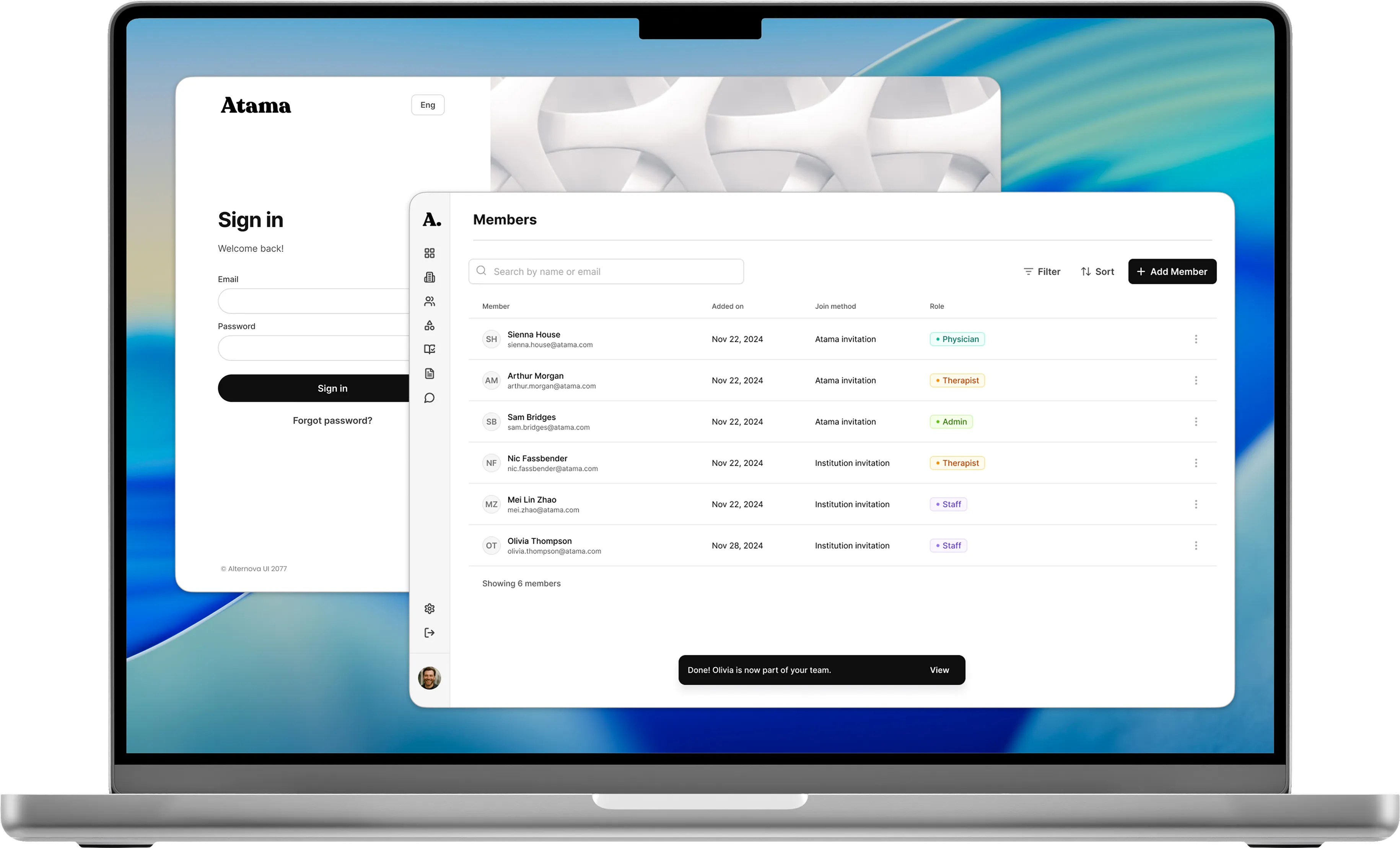
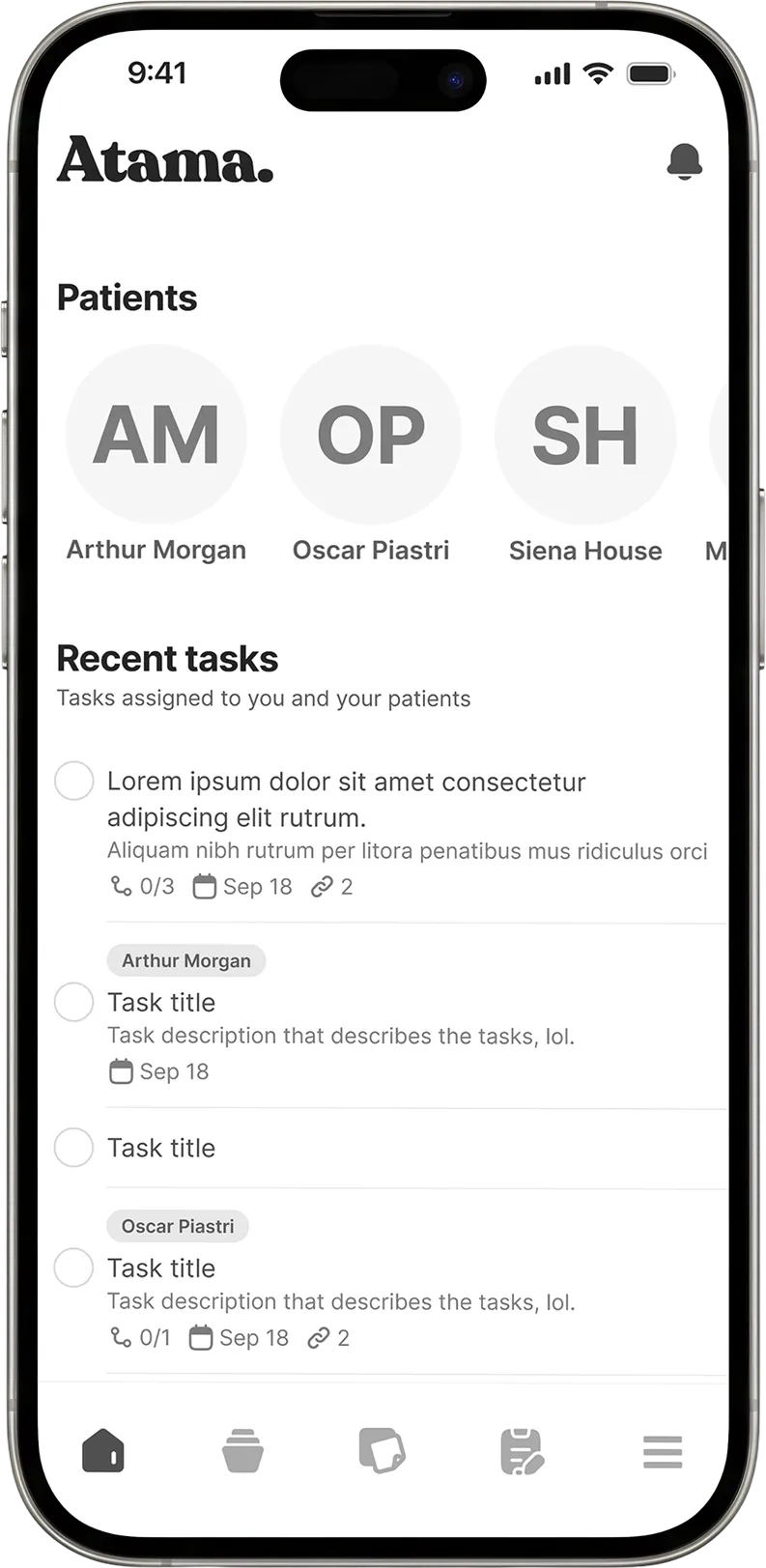
Atama is the starting kit we use at the company to build products faster. It’s a white-label base for web and mobile: the features almost every product needs (sign-up, user management, surveys, tasks) already designed, built and tested, plus a design system that any designer can start from and restyle for a client.
A client comes to us with an idea, we check whether Atama already covers the basics, and we get to test a real MVP with real users much sooner. What’s left to do is what makes that client’s product different.
- to an MVP, down from 2–3 months
- <1 month
- Figma projects built on Atama
- 29
- components
- 1,000+
At a glance
- My role: Product designer. I was assigned the project, but I had a say in every decision about which features to include. I defined how each one should work at its minimum and built the design system under all of them.
- Scope: 13 reusable features across web and mobile, and a design system with 1,000+ components.
- The decision that mattered: standardize only what most products actually need, and build each feature as a complete module, designed, validated, coded and QA’d.
- Outcome: MVPs with basic features went from 2–3 months to under one. Our designers now start from Atama, which has been used in 29 Figma projects.
Context
Every new product needed the same basics: sign-up, user management, surveys, tasks. And every time, we built them from scratch. That meant design time, development time and QA time. It also pushed back the moment we could put something in front of real users.
Clients were paying for it too. A big part of their budget was going into rework on basic features, instead of the parts that made their product theirs.
So at some point the question was simple: why were we rebuilding the same things?
What we standardized
The first step was deciding what deserved a place in a reusable base. We went through every project we’d done, the ones still in progress and what clients were asking for, and looked for what kept coming back. For each feature I looked at what we’d built before and what the ideal version should be, then defined the minimum it needed to work inside any product.
I was handed this project, but I wanted to be part of the decisions about what went in. The base had to reflect what we actually needed.
Web7
- Sign up and log in
- Settings
- Institution management
- User management
- Survey management
- Projects and tasks
- Resources
Mobile6
- Sign up and log in
- Settings
- Client/patient profile
- User management
- Task viewer
- Survey viewer
Each feature was designed, validated, built and QA’d as a module, so it could go into any project without rework. I stayed in constant contact with the developers throughout, so that what we defined in design was what they built.
The design system
Before designing any feature, I built the system that would hold all of them. It follows atomic design, in three layers:
- Foundations: tokens for color, typography, spacing and more, for both web and mobile.
- Components: buttons, inputs and the rest of the building blocks.
- Patterns: headers, modals, tables, cards and other elements made of those components.
It ended up with more than 1,000 components (counting variants), 108 styles and 452 variables.
Customizing it for a client doesn’t mean redesigning anything. Color and typography tokens live in the foundations, so changing them updates the whole system. In simple words: a new client’s brand is one change, not hundreds.
In production
Atama has been used in 29 Figma projects. These are three I worked on directly:
WrapApp
Connects case workers with people who have experienced violence. It runs on web and mobile and covers three types of user. Atama ships with five base roles, and this project needed fewer.
LifeSpan
Tracks mental health and stress levels of medical residents, on web and mobile.
Cenextra — Sky Therapeutics
A web and mobile app for treating children with ADHD. It follows progress in games played in another app, so parents and therapists can see how things are going and how the child is evolving.
In each one, the base gave us a working product to test with real users sooner. What we saw there told us what to customize for that client.
Outcomes
By the end of 2024, most of the features were ready to use in Figma, front end and back end. In projects that started in 2025, the difference showed. MVPs with basic features used to take 2–3 months. They now came in under one. With the basics already solved, we could put a working product in front of real users earlier and spend our time on what each client actually needed.
All the designers use the design system as the starting point for any project. 29 Figma projects have been built on Atama.
What I took away
- A reusable feature isn’t reusable until it’s finished. Designing it wasn’t enough. It had to be built and tested too, or the rework just moved somewhere else.
- Customizing has to be cheap, or nobody does it. That’s why brand changes live in the tokens.
- Being assigned a project doesn’t mean you can’t shape it. The most useful part was having a say in what went in.

